Lubabalo Dlwathi

DESIGN SECTION

Comprehensive documentation of my Interaction Design process, UI/UX decisions, and creative development.

DESIGN OVERVIEW

Aesthetic Statement: My goal is to create a balanced, modern digital presence that is both functionally robust and visually compelling. The design seamlessly integrates technical excellence with a clear user experience, guided by continuous user feedback and design refinement.

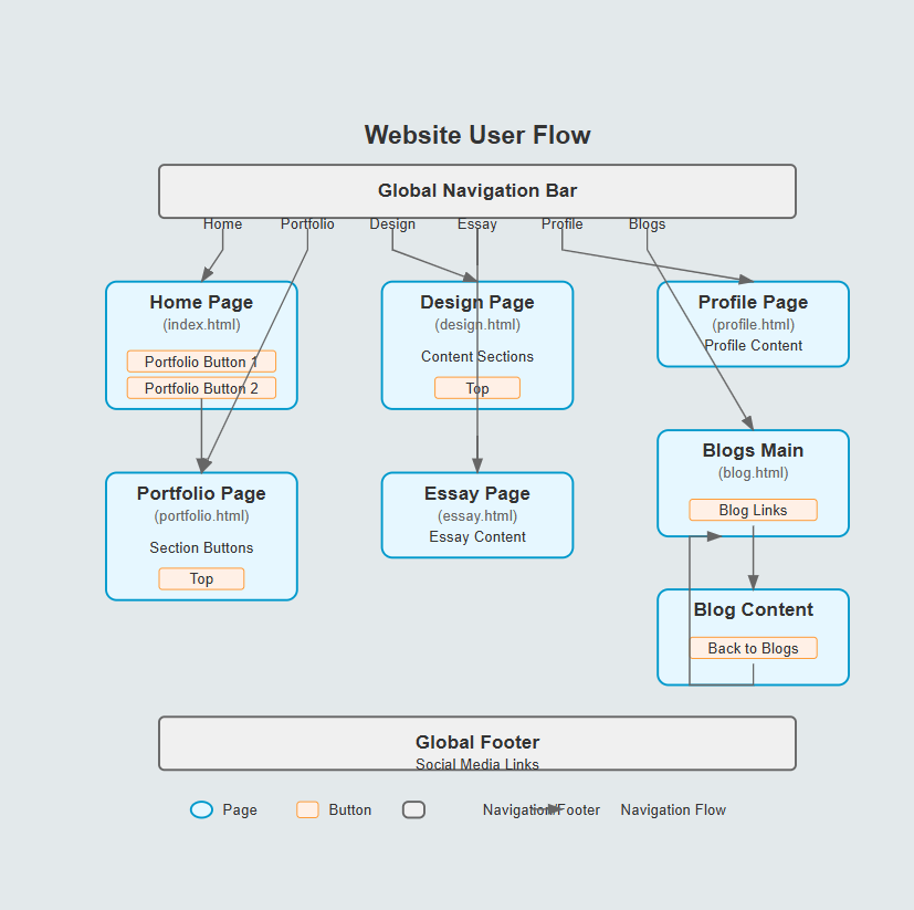
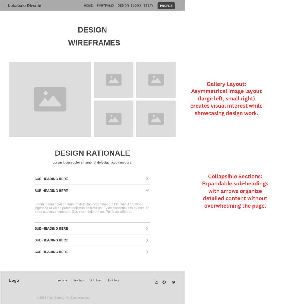
This section documents my Interaction Design (IxD) process, aesthetic decisions, and accessibility considerations. Every design choice is made with usability, clarity, and effective communication in mind. The documentation includes initial ideation, reflections on iterative testing, and a final consolidation of style and structure.

Overall Website Goals

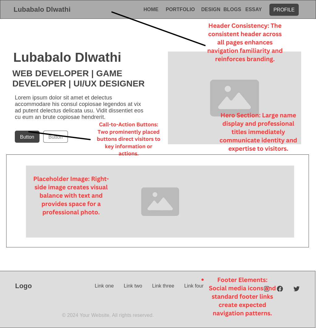
The primary objective of this portfolio is to present my work with both technical and creative excellence. In addition to showcasing projects, the website serves as a transparent narrative of my design journey.

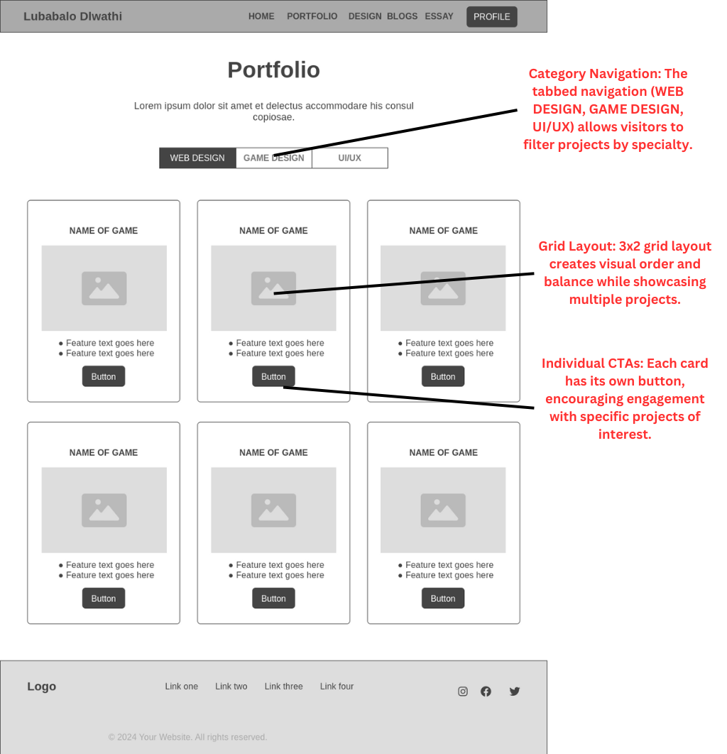
  • Demonstrate Technical Versatility: Rather than compartmentalizing my skills into rigid categories, I implemented a subtle tagging approach that highlights how different skills connect across projects, emphasizing my adaptability across different types of work.
  • Communicate Design Thinking: I deliberately included process work alongside finished pieces, inviting viewers behind the scenes of my creative process.
  • Create Meaningful Connections: Instead of a generic contact form, I tailored contact prompts to appear in relevant contexts throughout the site.
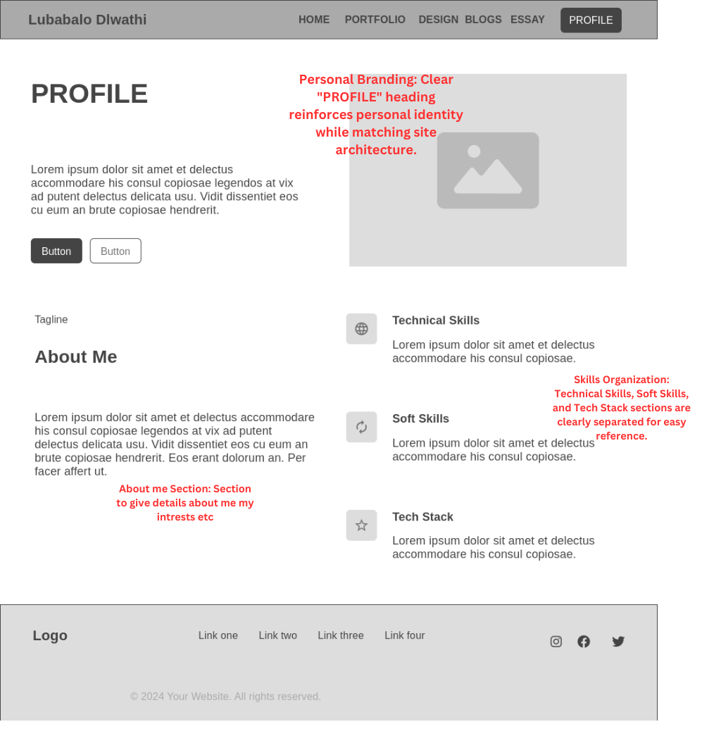
  • Balance Professionalism with Personality: I developed a consistent voice that demonstrates competence while revealing genuine enthusiasm for my work.
  • Prioritize Accessibility: I researched accessibility guidelines early in the process, incorporating them into my design decisions from the beginning.

INTERACTION DESIGN PROCESS

Goal Alignment

My IxD process began with defining user personas and mapping out user journeys. I chose this approach because it placed human experience at the center of my design thinking from the start. By sketching personas representing my target audience—from tech recruiters to fellow designers—I created relatable benchmarks that guided my subsequent design decisions.

Information Structure - Content Mapping

For journey mapping, I adapted the standard UX journey map by incorporating emotional touchpoints, helping me identify moments where users might experience confusion or frustration. This emotional dimension proved invaluable for understanding potential pain points that a purely logical approach might have missed.

User Flow - Screens, Behaviour, and Decisions

Rather than depicting only idealized journeys, I included alternative paths and potential points of confusion based on feedback from classmates who reviewed early prototypes. This honest approach helped me identify and address navigation weaknesses before finalizing the design.

Selected Interface Elements

  • Persona Development: Rather than relying solely on assumptions, I based my personas on conversations with classmates, professors, and industry contacts, incorporating their perspectives into detailed persona profiles with specific goals and technical knowledge levels.
  • Wireframing Approach: I started with pen and paper sketches before moving to digital tools, allowing for quick exploration of multiple layout possibilities without getting caught in the details too early.
  • Iterative Refinement: I shared early concepts with peers and incorporated their feedback before committing to final designs. This collaborative approach helped identify navigation issues early on.

Design Timeline Evolution: What began as a sequential plan quickly evolved into a more flexible approach as I realized certain sections needed to be developed in parallel. This adaptation allowed me to incorporate new insights as they emerged throughout the project.

WIREFRAMES

My wireframing process evolved through several phases, each offering distinct benefits. I discovered that starting with quick sketches before moving to digital tools gave me more creative freedom at the crucial early stage.

For initial concepts, I filled several pages of my sketchbook with rough layouts, exploring different possibilities without the constraints that digital tools sometimes impose. This analog approach sparked ideas I might not have considered if I'd jumped straight into digital wireframing.

Main Layout Wireframe

Main Layout

For the main layout, I experimented with asymmetric design rather than defaulting to a centered hero section. This created more visual interest and naturally guided the eye through the content, creating a more engaging first impression than a strictly symmetrical approach.

Portfolio Page Wireframe

Portfolio Page

The portfolio cards implement a subtle hierarchy rather than uniform tiles. This approach allows featured work to stand out while maintaining a cohesive overall structure, helping visitors quickly identify key projects without becoming overwhelmed by options.

Profile Section Wireframe

Profile Section

For the profile section, I adopted a narrative approach over a traditional resume format. This storytelling structure creates a more engaging and memorable impression than a straightforward list of skills and experiences.

Design Page Wireframe

Design Page

The design section uses linked subsections rather than a single continuous scroll, breaking complex information into manageable chunks. This structured approach helps viewers digest information without feeling overwhelmed by a wall of text.

Blog Section Wireframe

Blog Section

For the blog layout, I combined article previews with clear navigation, finding middle ground between overwhelming visitors with too much content and forcing them to click through pagination to discover articles that might interest them.

Essay Page Wireframe

Essay Page

When designing for long-form content, I focused on readability and navigation. The layout incorporates clear section headings and breathing room between paragraphs, making academic content more approachable than the dense formatting often used for essays.

STYLE GUIDE & PROCESS

Style Guide & Typography

Typography and Colours

My typography choices evolved through experimentation with different font combinations until I found a balance between distinctive character and practical readability:

Headings (Orbitron): I selected Orbitron for headings because its geometric precision creates distinctive anchors throughout the page. While I also considered more conventional options, Orbitron's unique character better reflected the forward-thinking impression I wanted to create.

Body Text (Exo 2): For body text, I needed something highly readable that would harmonize with Orbitron without mimicking its distinctive style. Exo 2 provides excellent legibility while maintaining a subtle connection to the geometric qualities of the headings.

Labels/Buttons (Roboto Mono): For interactive elements, I deliberately chose a monospaced font to visually distinguish these components from content text. This separation helps users quickly identify interactive elements within the larger content ecosystem.

Colour Palette Development

My color palette emerged from extensive exploration, considering both aesthetic appeal and practical considerations like accessibility and emotional tone:

  • Electric Blue (#536DFE): Serves as the primary action color, creating energy and focus while maintaining sufficient contrast against both light and dark backgrounds.
  • Neon Cyan (#00E5FF): Complements the primary blue as a secondary accent for hover states and progress indicators.
  • Metallic Grey (#ECEFF1) and Dark Charcoal (#37474F): Provide a sophisticated backdrop that allows the accent colors to shine while remaining comfortable for extended reading.

The Style Process

My approach to style development started with understanding content needs rather than imposing a predetermined aesthetic. I began by organizing content and identifying key user tasks, then explored visual treatments that would support these functional requirements.

I created several mood boards representing different potential directions before settling on the final approach. This exploration helped me identify which visual elements resonated most strongly with the professional yet forward-thinking impression I wanted to create.

UI, UX & USER NAVIGATION

User Interface (UI) Component Approach

Rather than designing each page as a standalone entity, I developed a system of reusable components that appear consistently throughout the site. This approach not only saved time during development but created a more coherent experience for visitors as they move between different sections.

For interactive elements, I established consistent patterns for different states (default, hover, focus, active). This predictability helps users quickly understand how to interact with the site, reducing the learning curve typically associated with unfamiliar interfaces.

User Experience (UX) Strategy

My UX approach focused on reducing cognitive load through predictable patterns and clear visual cues. Rather than forcing users to remember how to navigate the site, I implemented consistent indicators that help them understand their current location and available paths forward.

When fellow students reviewed early prototypes, some mentioned feeling uncertain about where they were in the site structure. In response, I enhanced location indicators and navigation cues, which noticeably improved their confidence when exploring different sections.

Navigation & User Control

The navigation system balances comprehensive access with simplicity through thoughtful organization. Primary navigation remains consistent throughout the experience, while contextual links within content sections help users discover related information naturally.

For mobile experiences, I adapted the navigation to work within tighter space constraints while preserving access to all sections. This required more than simply collapsing the desktop menu—I reconsidered the hierarchy and interaction patterns to ensure the mobile experience remained intuitive.

Design Rationale

After sketching several navigation concepts, I settled on a persistent top navigation bar that remains visible throughout the site. When I showed prototypes to classmates, they consistently found this approach more intuitive than hidden navigation options, particularly when exploring the site for the first time.

User Flow Diagram

Creating this diagram wasn't just a documentation exercise—it actively shaped my design decisions throughout development. When considering new features or content organization, I referred back to this visualization to ensure changes would enhance rather than complicate the user journey.

ACCESSIBILITY CONSIDERATIONS

Accessibility informed my design decisions from the beginning rather than being addressed as an afterthought. This integrated approach helped create an experience that works well for all users, regardless of their abilities or how they access the site.

  • Semantic HTML Structure: I built the site using proper semantic elements like <header>, <nav>, <main>, and <section> rather than generic <div> containers. This creates a meaningful document structure that benefits screen reader users while also improving SEO and maintainability.
  • Thoughtful Alt Text: For images, I wrote alt descriptions that convey not just what's shown but why it matters in context. For instance, wireframe images include descriptions of key layout features rather than simply stating "wireframe image."
  • Color Contrast Implementation: I checked color combinations using contrast tools to ensure text remains readable across different backgrounds. In some cases, I adjusted my initial color choices to improve readability while maintaining the overall aesthetic direction.
  • Responsive Design Approach: My responsive strategy focuses on content relationships rather than specific device dimensions. This content-first approach ensures the site works well on devices I haven't specifically tested.
  • Manual Accessibility Checks: Beyond automated validators, I tested the site using keyboard navigation and browser accessibility tools. This hands-on approach revealed practical issues that technical checks might miss, such as logical tab order and intuitive focus indicators.

I also implemented keyboard navigation patterns that go beyond basic tab functionality, ensuring that all interactive elements can be accessed and activated without a mouse. These considerations benefit not only users with disabilities but also power users who prefer keyboard shortcuts.