Design Section
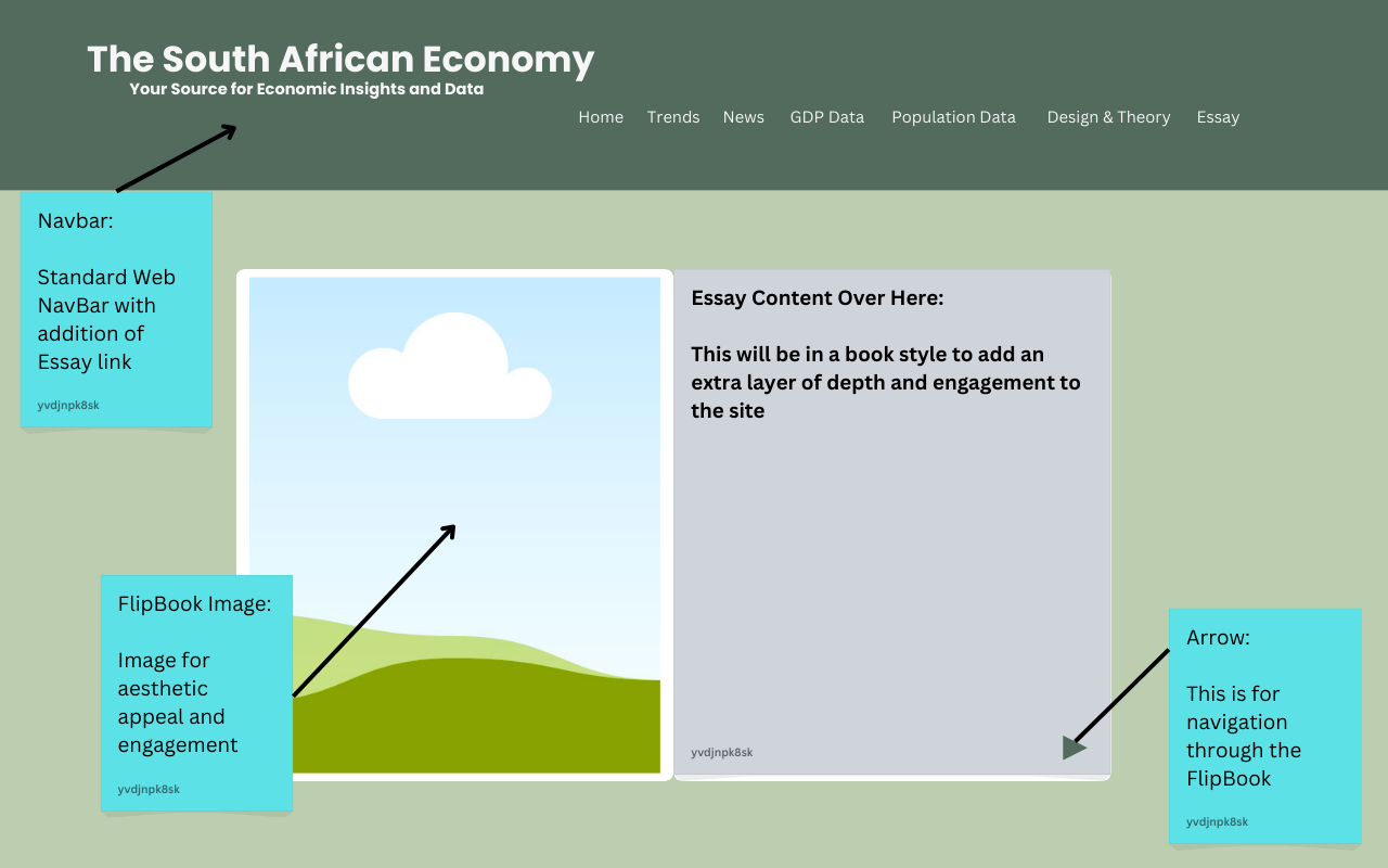
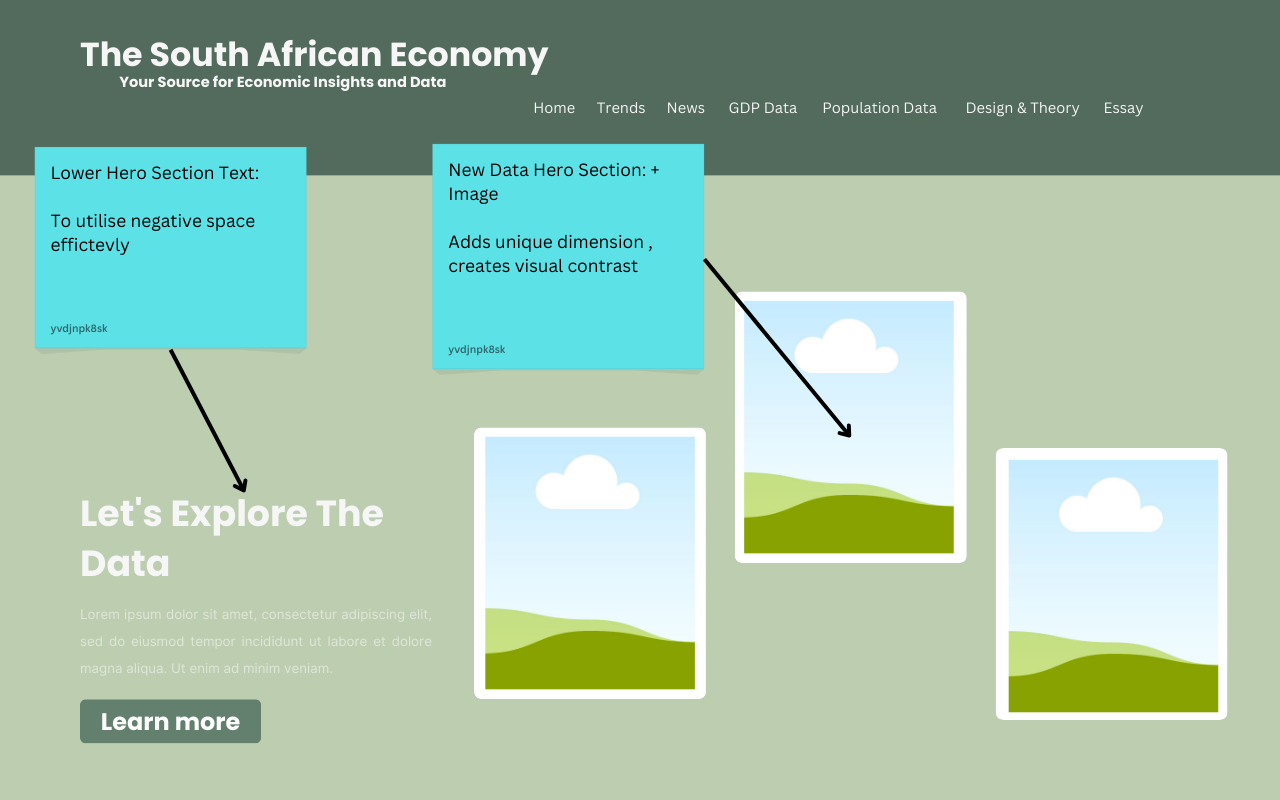
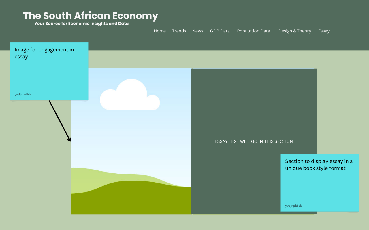
This section contains wireframes and style guides for the site, reflecting rationales for all UI and UX decisions made.
Wireframes
.png)
The wireframes illustrate the layout and structure of each page, focusing on user flow and ease of navigation. Each section is designed to guide the user seamlessly through the content, prioritizing essential information.
Style Guide
Fonts
Font Family: Arial, sans-serif – Chosen for its readability and modern appearance, ensuring accessibility for all users. The use of a sans-serif font promotes a clean and uncluttered aesthetic, making text easy to read on various devices.
Some of the h1 elements also change color upon hovering, this emphasizes the colors of the South African flag and adds a layer of interactivity to the website
Color Palette
- Primary Color: #28a745 - Symbolizes growth and prosperity, aligning with the site's focus on economic insights. This vibrant green is used for buttons and highlights to draw attention and encourage interaction.
- Secondary Color: #5E716A - Complements the primary color, providing balance and a professional look. This muted shade is utilized in headings and secondary buttons to create visual hierarchy and maintain user engagement without overwhelming the senses.
- #f8f9fa - A neutral backdrop that enhances readability and content focus. This light color ensures that text stands out clearly, supporting a user-friendly experience across different sections of the website.
Button Styles
Button Design: Buttons feature rounded corners, a vibrant green background, and white text for visibility and user engagement. The rounded corners soften the button's appearance, inviting users to interact with them. Hover Effects: The hover state changes the background to a darker shade (#218838) for interactivity, enhancing user experience. This subtle effect provides immediate visual feedback, encouraging clicks and reinforcing the button's functionality.
Rationales
The design decisions reflect a user-centered approach, with accessibility considerations including high contrast for readability and a responsive design to ensure usability on various devices. Key UI choices include:
- Navigation Structure: A clear and straightforward navigation bar ensures users can easily find relevant content.
- Dynamic Backgrounds: Changing images related to South African landscapes enhance the visual appeal while maintaining user focus on the text.
- Engagement Features: Interactive elements like charts and carousels provide users with dynamic ways to engage with economic data.
Changes Made From Wireframes
This section contains the essay and preparatory work/rationales for the Data Visualisations, including independent research and reflections.
Nav Bar & Data
Initially the nav bar was meant to exclude the page leading to the GDP and Population Data visiualizations, however to allow for more emphasis on the data I decided to give each their own page and make them more easily accesible
Home Page
The layout of the home Page in the wireframes felt rather document like thus to mak the website more interactive and dynamic I decided to use various cards and shadows to create an intresting sense of depth and feel.
Styles
While In the wireframes a different color scheme is displayed, I decided to change it as I wanted to entrench the idea of South Africa with the user, thus many of the images and text use colors from the South African Flag
Theory Section
This section contains the essay and preparatory work/rationales for the Data Visualisations, including independent research and reflections.
Data Visualisation Rationale
Data visualization methods were selected based on their effectiveness in conveying complex economic data. For instance, line charts were used for GDP trends to highlight changes over time, while pie charts illustrate proportions of different economic sectors, providing intuitive understanding for users.
Reflection
The development of my website dedicated to the South African economy has been both rewarding and challenging. Initially, curating a comprehensive array of data and ensuring its accuracy was daunting. Navigating the complexities of data visualization with tools like D3.js required significant learning and experimentation to create engaging graphics. Additionally, designing a user-friendly interface that clearly communicates complex economic concepts posed its own set of challenges. Balancing aesthetic appeal with functional clarity has been an ongoing endeavor. Despite these hurdles, each obstacle has contributed to my growth as a developer and content creator, reinforcing my commitment to delivering a valuable resource that enhances understanding of South Africa's economic landscape.
Intention
Creating a website about the South African economy stems from my passion for understanding the complex dynamics that shape our financial landscape. South Africa is a nation rich in resources and diversity, yet it faces unique economic challenges and opportunities that are often underrepresented in global discourse. My intention is to provide an accessible platform where individuals can explore key economic indicators, trends, and analyses that directly impact their lives. By highlighting data visualizations and expert insights, I aim to foster informed discussions and promote a deeper understanding of economic issues among South Africans and interested global audiences. This project not only reflects my commitment to empowering individuals with knowledge but also my desire to contribute to the broader conversation about economic development and sustainability in South Africa.
Resources & Design Elements
Explore our design elements, including wireframes, essays, and additional resources that showcase the development of The South African Economy website.
Design Section
This section contains wireframes and style guides for the site, reflecting rationales for all major UI and UX decisions made and changes made.
Wireframes


.png)
.png)
.png)